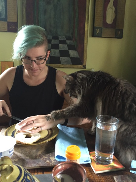
Yes, that’s a litter box under my press. As Tennyson fades into extreme old age, he chose the space where I kept my rags under my press as his salle de bain, so it seemed to make sense to move his litter there. Also, using an antique section of banister, we are able to keep the dogs from devouring the contents of the litter, which is simply gross and where I draw the line at humility. It means as I work on getting the type printing just right or fighting with make-ready on wood engravings, I catch the occasional whiff of…. Is it me? Surely not! Ahhh, the cat.
The press, being both the source of beauty, elegance and style – and Tennyson’s depository – does bring me down to earth when things are going well, as they have been for the past year or so. In 2015, I received word that the University of Toronto’s Fisher Library wanted to acquire all books and broadsides printed to date, with a keen interest in anything else I come up with.
The year also saw me blaze through 20 shows: indoor with table or booth, and outdoor under tent. These shows were on the whole very successful, and just a few changes I will be repeating the same number in 2016. Shows are a wonderful way to meet new people, and to keep up with friends and collectors.
As for what shows I’ll be doing, I’ll be adding a page to this blog, but a listing will also appear in my newly reinvigorated website, complete with an on-line store for prints, all to be found at www.greyweatherspress.com
The biggest news this year will be the release of the most ambitious project yet from the press: Ecclesiastes. Yes, Greyweathers Press is getting biblical, with a heft that will weigh in at an estimated 80 pages of beautiful Arches Text Wove, illustrated with 60 odd wood engravings. Stay tuned, a detailed announcement is forthcoming.

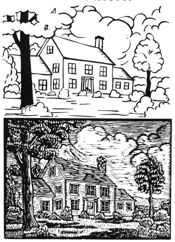
An early draft of the title page design.
So with all of this activity, Tennyson’s periodic visits to my press keep me from getting too full of myself, and rightly so. It is all about the work, after all, and not the accolades.


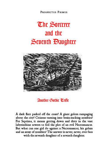 Coming to a Zombie Apocalypse near you,