Archive for the ‘Fine Press Printing’ category

On humility….

March 2, 2016

IMG_3260

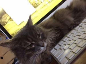
Yes, that’s a litter box under my press. As Tennyson fades into extreme old age, he chose the space where I kept my rags under my press as his salle de bain, so it seemed to make sense to move his litter there. Also, using an antique section of banister, we are able to keep the dogs from devouring the contents of the litter, which is simply gross and where I draw the line at humility. It means as I work on getting the type printing just right or fighting with make-ready on wood engravings, I catch the occasional whiff of…. Is it me? Surely not! Ahhh, the cat.

The press, being both the source of beauty, elegance and style – and Tennyson’s depository – does bring me down to earth when things are going well, as they have been for the past year or so. In 2015, I received word that the University of Toronto’s Fisher Library wanted to acquire all books and broadsides printed to date, with a keen interest in anything else I come up with.

The year also saw me blaze through 20 shows: indoor with table or booth, and outdoor under tent. These shows were on the whole very successful, and just a few changes I will be repeating the same number in 2016. Shows are a wonderful way to meet new people, and to keep up with friends and collectors.

As for what shows I’ll be doing, I’ll be adding a page to this blog, but a listing will also appear in my newly reinvigorated website, complete with an on-line store for prints, all to be found at www.greyweatherspress.com

The biggest news this year will be the release of the most ambitious project yet from the press: Ecclesiastes. Yes, Greyweathers Press is getting biblical, with a heft that will weigh in at an estimated 80 pages of beautiful Arches Text Wove, illustrated with 60 odd wood engravings. Stay tuned, a detailed announcement is forthcoming.

Screen Shot 2016-02-15 at 10.17.39 PM.jpg

An early draft of the title page design.

So with all of this activity, Tennyson’s periodic visits to my press keep me from getting too full of myself, and rightly so. It is all about the work, after all, and not the accolades.
IMG_4791


Book Arts & Small Press Show in Toronto

August 21, 2015

Two years ago I had the privilege to show my books in the womb of the Fisher Rare Book Library at University of Toronto. It’s happening again on September 12, 2015 from 10 to 5 pm at 120 St. George Street in Toronto, Canada. For more info, click here.

A view of what participants and attendees of the Fisher Small and Fine Press Fair see all day.

A view of what participants and attendees of the Fisher Small and Fine Press Fair see all day.

smallpress-poster lr

Ten Years: Pondering a Decade of a Press

February 12, 2015

01.GPLogo_redblack

Last night I had the very great privilege to speak to the Ottawa Valley Chapter of the Canadian Bookbinders and Book Artists Guild on the origins of the Press.

In preparation for this, I realized that the topic is really quite vast, and could be broken down into several distinct topics. For example, every book printed off the press has its own story, worthy of an entire conversation. There is the business side, of showing and selling, pricing and marketing. And there is the whole messy matter of art. For CBBAG, I chose origins.

I set the start date of Greyweathers Press as 2005, the year that I printed the first book, Coleridge’s Kubla Khan. However, the primary urges go back far earlier, rooted in a love of books and story. I loved comics when I was a kid, and still do although I do not collect nearly as much. In the early 1990s I took a bookbinding workshop but otherwise I just thought about producing books.

In 1996, an exhibit of the work of William Morris opened my eyes to the private presses, and it led me to the rich field of printing being done in Canada.

OLYMPUS DIGITAL CAMERA

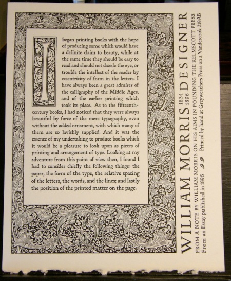
I like Morris’ sensibility here, although it does grate a bit with the border and drop caps from his magnus opus, the Kelmscott Chaucer, in this keepsake created digitally some years ago then rendered into a magnesium plate: “a definite claim to beauty.”

From there, an understanding of letterpress came, but that’s a blog for another day.

Letterpress is an umbrella that that overhangs many differing motivations. Some are called to ‘old school’ printing for the romance associated with the history of printing. There are enthusiasts of the equipment, or those wild-eyed collectors of type of every kind. Commercial letterpress is still viable for high end printing jobs, and lino and woodcut artists love letterpress for its reproduction excellence. For myself, books brought me to letterpress and the desire to produce books keeps me printing. I’m also working in the so-called ‘fine press’ tradition, going to sometimes absurd ends to achieve  quality in printing, inking, impression and binding etc. In fact, there are elements of all these things built into my motivation to print.


Measure twice, print once

December 13, 2013

IMG_0661 LR

There is always the temptation to just throw the type down and print. But for the last few days, I’ve been setting and dissing type on the zombie book, working out the letter and word length for the fully justified columns of text. No ink involved at all. It’s important because there is no way this time that I will be able to set the entire text with the limited type that I have; page one on the press may face page four, so working out all problems in advance is the way to go. Also, setting and dissing the odd paragraph in different sizes helps me get reacquainted with the medium — it has been awhile since I did much creative work on the press (year round-up report coming later in the month). The good news is that I seem to have worked out most of the typographic spacing issues, and that’s thanks in part to using Adobe software (Indesign) to create my page layout and dummy. It allows me to parse the type to match very closely the metal type and thus, if the moon and stars align, it becomes a simple way to impose and paginate the text. It should work; I’ll keep you posted!

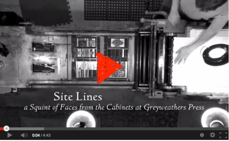
Sight Lines – A Short Video

October 4, 2013

SightLinesVideo

The Third & Elm Press

November 4, 2012

Click to view larger

Business and good fortune had us visiting Newport, Rhode Island a couple of weeks prior to Hurricane Sandy. The weather was extraordinarily beautiful and temperate, literally a calm before a storm. When I travel with Holly, I try not to schedule too much press activity, which can easily usurp a timetable. But destiny took a hand. While visiting a photography gallery called Blink, we learned that the owner’s mother ran a letterpress in the heart of Newport. On our last day there, Holly and I made sure to visit The Third and Elm Press, named (as you probably surmised) for the corner on which Ilse Burchert Nesbitt’s shop is located.

The home of the Third and Elm Press, located at Third and Elm in Newport, Rhode Island.

Ilse came to America from Germany in 1960, and set up the press with her husband, a calligrapher and book designer, in 1965. There are details and sample of her work on her website at www.thirdandelm.com. She is now 80 years old and not showing much sign of slowing down.

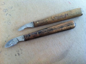
Isle has a very nicely organized studio. It is not large, but it holds an early 19th century “acorn” iron press, a good sized floor standing platin press, a cutter and several banks of type. While she has printed several books over the years, her primary focus these days is in making wood cut prints. In the long-established German tradition, she cuts her blocks using knives, as opposed to gouges and gravers.

A relief wood cut carved with knives on the plank.

The style of knives that Ilse uses for cutting her blocks.

Close-up of the plaque on the ‘acorn’ iron press.

A close-up of Ilse’s work-horse platin press, with a rainbow hue of inks on the underside of the inking disk.

I admired Ilse’s cutting desk, which folds down elegantly when not in use. Most print studios need space-saving solutions like this. (Mine certainly does!)

All the type drawers have beautiful calligraphy labels. Since I live with a calligrapher of some note, I have put Holly on notice that I would like this treatment for my type cabinets as well.

I make a habit of carrying samples of my books and prints with me where ever I go, so I was able to show them to Ilse and recieve a critique. She was refreshingly frank, or perhaps I should say refreshingly Teutonic. She thought my lines might “open up” and become more naturalistic if I abandoned gouges and gravers and adopted the knife as my principal tool, something I will certainly try when I turn my hand to cutting on the plank. She felt that my lines were too clean, that they followed each other too closely, that I needed to “loosen up.” All good advise, and in a sense, that’s the direction my linos had been going prior to my jump into wood engraving.

We spent a very enjoyable afternoon visiting with Ilse, hearing her thoughts on the ‘business’ and dropped some money in her gallery upstairs on a book and two prints. Most of all, it was simply inspiring to meet a fellow printer and print-maker who is steadily pursuing her passion and not letting anything, least of all aging, get in the way.

Type on Tintern Abbey

May 26, 2012

I print my books using hand set lead type in much the same manner that Gutenberg used over 500 years ago. I would say the similarities end there: he not only had to found his own type, but invent a way to do it to make composing his bible a viable exercise. All I had to do was email Ed at Swamp Press, as I have done every year or so over the past seven years, and order lead type.

My order is always the same: Italian Oldstyle in roman and italic. It arrives carefully packed in a crate, and the process could be likened to unpacking an Egyptian mummy. Here’s an order that came shortly after work on Tintern Abbey finished. There’s an outer shipping box, then packing material in and around the inner sarcophagus…. er, I mean type packets:

Italian Oldstyle type, 10 pt roman and italic in four packages. (Note rule and Olfa knive to the right for scale)

Excitement builds as the outer layer comes away to reveal:

Kind of like Carter opening up Tut’s tomb. Then, the moment of truth:

A body of type.

There’s a reason for all this extraordinary packing. Ed and I have found, over the years, that lead type packets crossing the great divide between the USA and Canada tend to be violated… er, examined by curious border authorities of both nationalities, I presume. After fatally disrupting the packaging, the authorities send my type back out into the postal stream unsealed! This has happened on two previous orders. This time I asked Ed to send it via UPS; it costs more, but my type arrived in perfect order.

Swamp Press sells monotype which is somewhat softer than foundry type; the latter is an alloy, but there’s not much foundry type being made anymore. Monotype is really meant to be used for a while, then ultimately melted down and recast again, with some always kept on hand in the cabinets for small jobs and corrections. Monotype is fine for my purposes; I’m doing mostly book work, and very limited press runs. However, my 12 point roman takes the brunt of the press, and has been used repeatedly now over the last six or seven years. And it’s starting to show in certain of the most frequently used letters: e, l, r, g, h, i, s,  and t. Hairlines, breaks, wear-out, broken serifs, worn tails and balls etc. I’m spending a lot more time at the proofing stage stooped over the press, tweezering out offenders, tossing them in the hell box and replacing them. The problem is that after the book is finished, and I’m with a collector or at a show perusing the book, that’s when I see the broken piece of type that I missed during production! It’s frustrating, but it is a risk when working with even gently used type. The older and more worn the type, the more vigilant the printer must be.

Swamp Press has an amazing library of monotype faces available. Check out their site here.

Typesetting Begins on Tintern Abbey

January 29, 2012

I cleaned up the press room and then got out the lead to begin setting type on the next book, a fine press version of Tintern Abbey. In spite of having already played with some ideas on the computer, I still changed the size and style of the introduction title (10 pt italic caps from 14 pt roman small caps), and had already consulted the the bible (Robert Bringhurst’s Elements of Typographic Style) for some guiding doctrine. And that’s just one line into it!

The letters ‘INTERN ABBEY’ are set in 12 pt small caps, and you guessed it, the missing “T” will show up curing another printing in red (or green) as a raised capital, probably 18 pt. The third word in (first) brought me quickly to another quandry: to use dipthongs, or not to use dipthongs, that is the question. And Hamlet thought he had it bad. The dipthongs in my font of Italian Oldstyle include fused versions of “st”, “ct” “oe” and “ae”. Ligatures (ffi, fi, ffl, fl, ff) are standard in the font and in common use, but dipthongs can be consider a bit twee, if not downright pretentious. Since the poem is getting on over two hundred years old, I think I can get away with dipthongs, so the word “first” is made up of just three pieces of lead, the “r” being the only single character.

My original plan was to fully justify the text, but when I examined my reasons for doing so it came pretty much down to “cuz I want to” which is not necessarily acceptable. I took some time earlier today and flipped though my own small collection of finely printed books, and noticed that in most of these (but not all) designers fully justified the text block when the block was quite large, perhaps as wide as 6″. Most of the smaller books had flush left, or jagged right if you will. It looks better in these books, so I’m fairly certain it will in Tintern Abbey. I’ll know when I proof the first spread of type. These other fine presses were using smaller type, which may be a factor. (Note to self: pick up a truck load of 10 pt type in next type order!)

The introduction is written by Queen’s University Professor Mark Jones, and I expect it may be the first time his words have ever been set in metal.

Tintern Begins

September 9, 2011

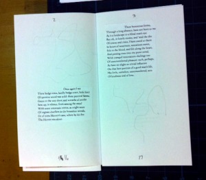
All the text is in for Tintern Abbey, the next book on the press. The pagination is done in the form of a mock-up of the book. The paper has arrived from Saint Armand in Montreal, and I am very excited to dampen it and begin printing. First, however, the dummy tells me that I have to generate 12 illustrations for this book. <Sigh.> While I’m working that out, I’ll be dissing all the type form the many little projects I’ve done, as well as some still on trays from Graven Images. Then I can begin setting type for the various blocks of text from the poem, and from the introduction by Prof. Mark Jones, Queen’s University.

So that metaphorical train is finally leaving the station. Hoping to arrive early December.

As soon as some illustrations are ready, I’ll print and send out the prospectus.

Paste-up rough mock-up of Tintern Abbey


Digitally imposed pagination layout (Thank you CheapImposter!) The big black squares are illustrations, but you have to use your imagination at the moment.


Mmmmmmm.... Saint Armand paper cut and folded into a binding maquette for the book. Dig the decal edges....

Next 25 copies ready

February 21, 2011

Cover and spine labels for Graven Images

Today, I inked the press up and printed the cover and spine labels in order that I might finish off the freshly bound copies of Graven Images. Tomorrow I’ll cut them down, glue them onto the cover and spine, then prepare send off several copies to satisfy orders from late last year.

I intend to hand-bind several more copies using the hand-painted papers Holly made back when we thought they’d all be done that way. These are earmarked for special destinations. The two that I’ve already done worked out quite well.

Now on to other projects!